


Corridor Revamp at my Restaurant

This is part of a series documenting the process of setting up my first restaurant, Brasserie Onni, set to open in the spring of 2025.
Corridors—we all love them, and for good reason. Named after its inventor, the great Mesopotamian king Corrid-Ur, who needed a way to get to his annex where he stored his many garments. As we all know intimately, many of life’s best moments are found in the corridor—walking to the bathroom, looking for the bathroom, waiting for the bathroom to be unoccupied, and so on. These are the moments that now need to be enhanced at my restaurant Brasserie Onni before opening for the busy season in spring 2025.

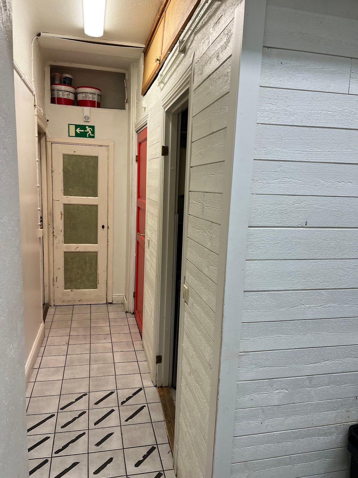
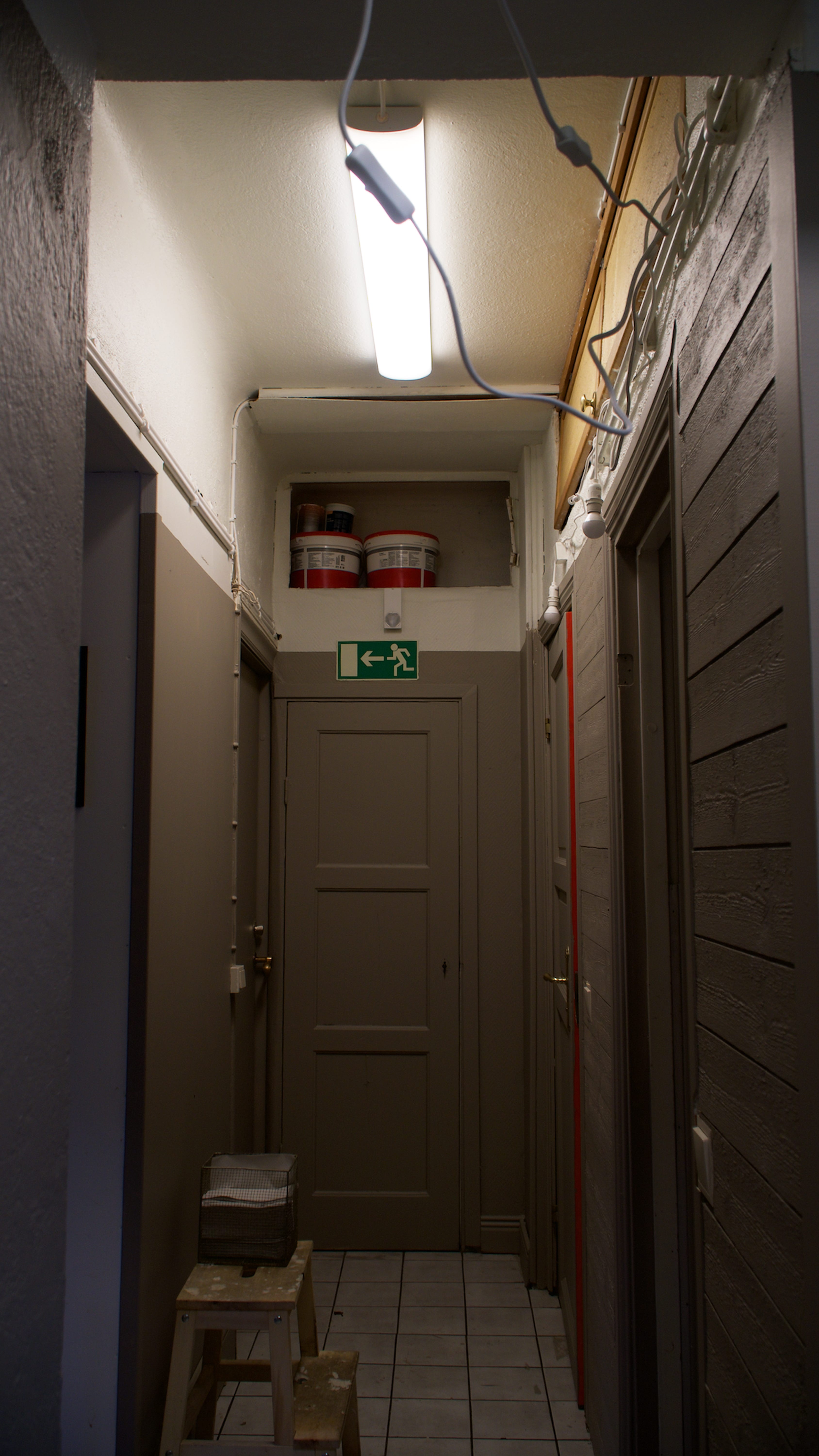
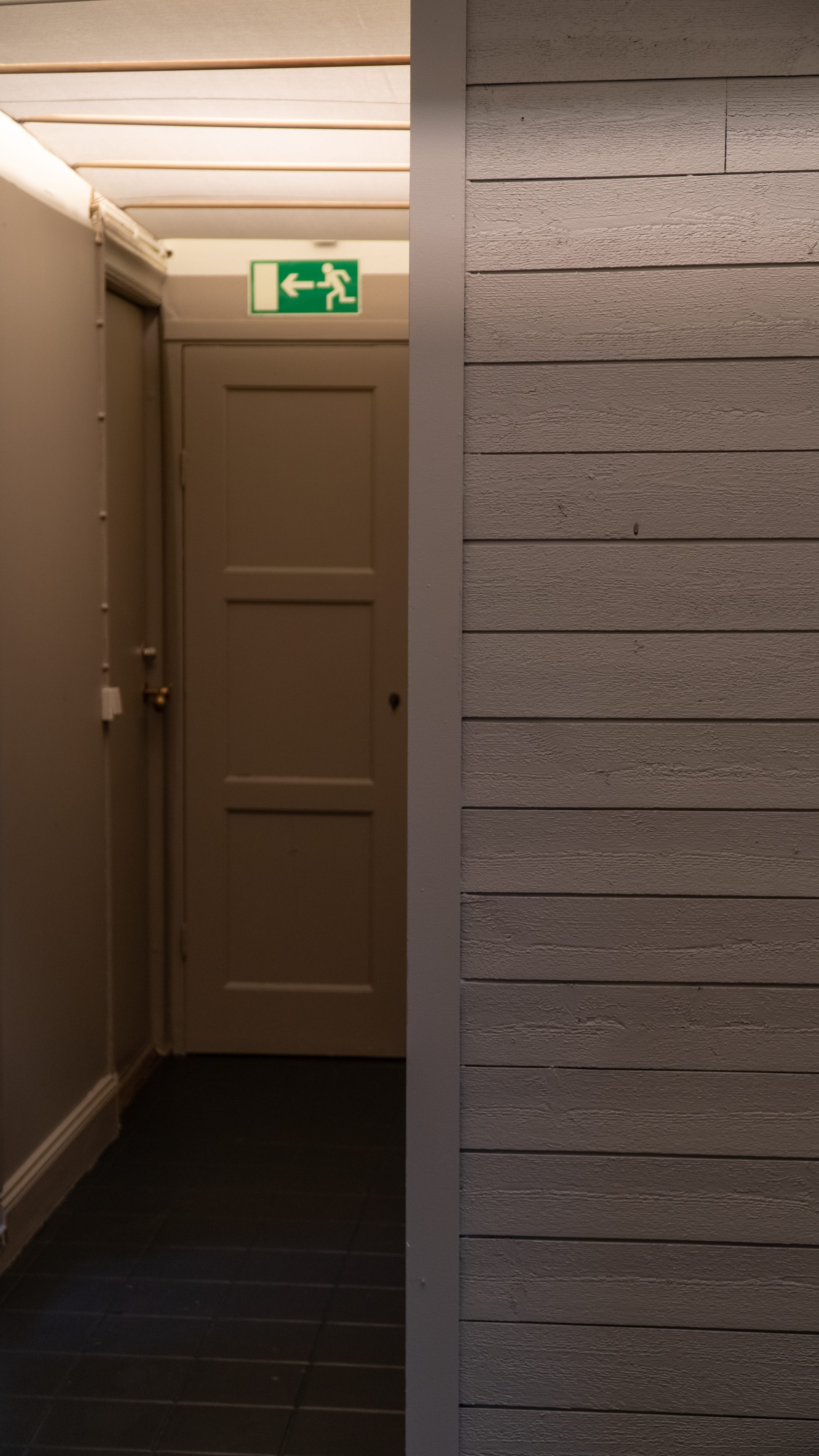
The corridor connecting the main dining area to the kitchen, pantry, dishwasher room, guest bathroom, back door, and the stairs leading down to the cellar—where our in-house microbrewery, Taxinge Bryggeri, is located—was in desperate need of attention.
Narrow (less than a meter wide) and painted in a plain shade of white, the space felt uninviting, as if it wasn’t meant for customers to visit. During our soft launch over the Christmas season, when guests were guided toward the bathroom, many doubled back, confused upon entering the corridor, as if walking in on an uncle sitting on the toilet.
The tiled floor, slippery as a snake oil salesman when wet, also had the unfortunate trait of looking dirty no matter how much it was cleaned. While the high ceilings were a plus, the top meter or so was cluttered with buckets of paint, cleaning supplies, and spare odds and ends tucked away on shelves up high. Though practical, it looked disorganised and uninviting, making it a clear candidate for the next stage of this light renovation.
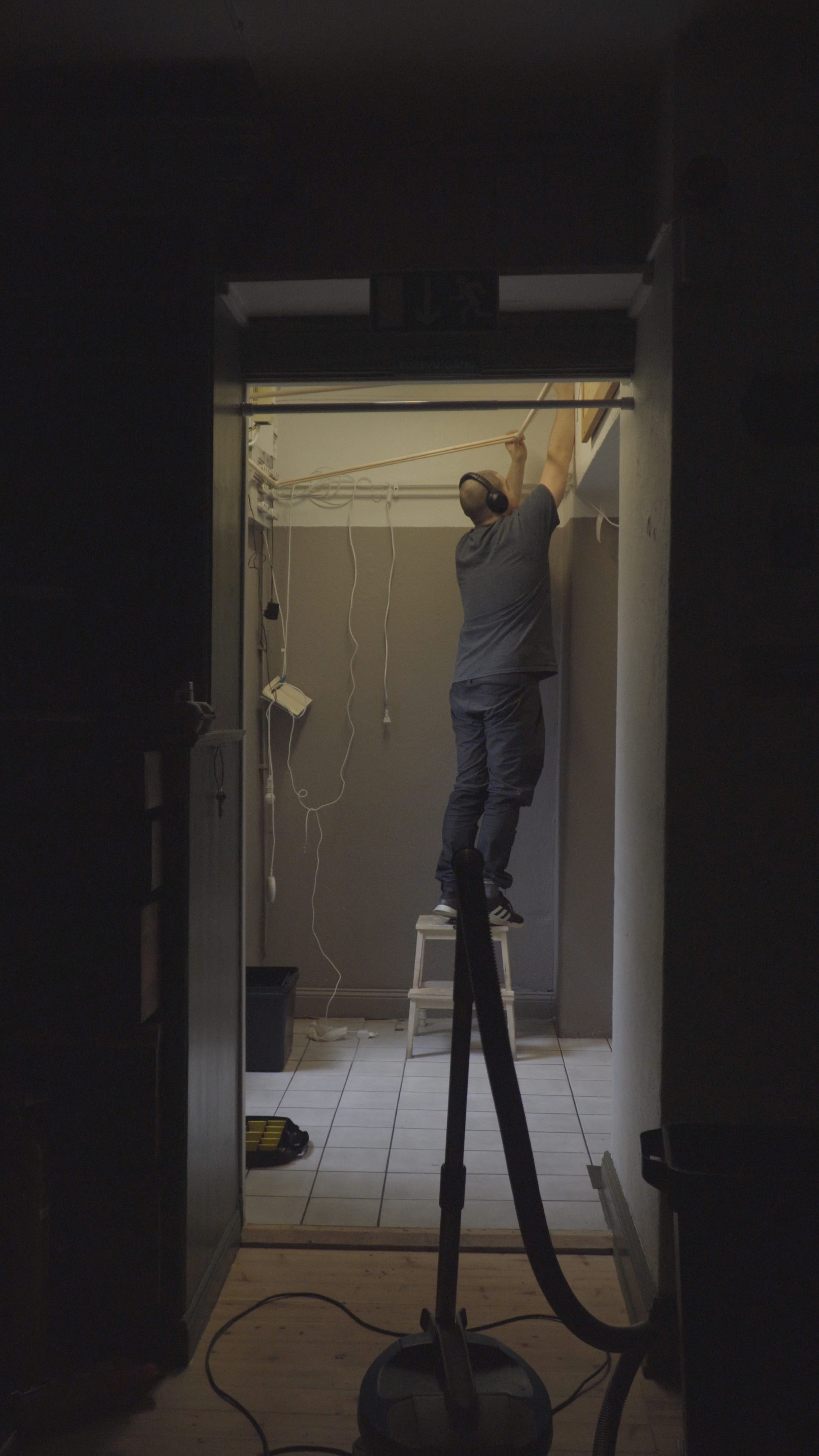
Here’s the state of the corridor before getting started:

Identifying Key Issues to Fix
To improve the space, a few different aspects needed attention:
✔ Walls – The stark white walls needed to be rethought.
✔ Overhead storage – Practical but unsightly. Should be concealed.
✔ Lighting – Harsh, fluorescent, and unflattering. Needed a more controlled setup.
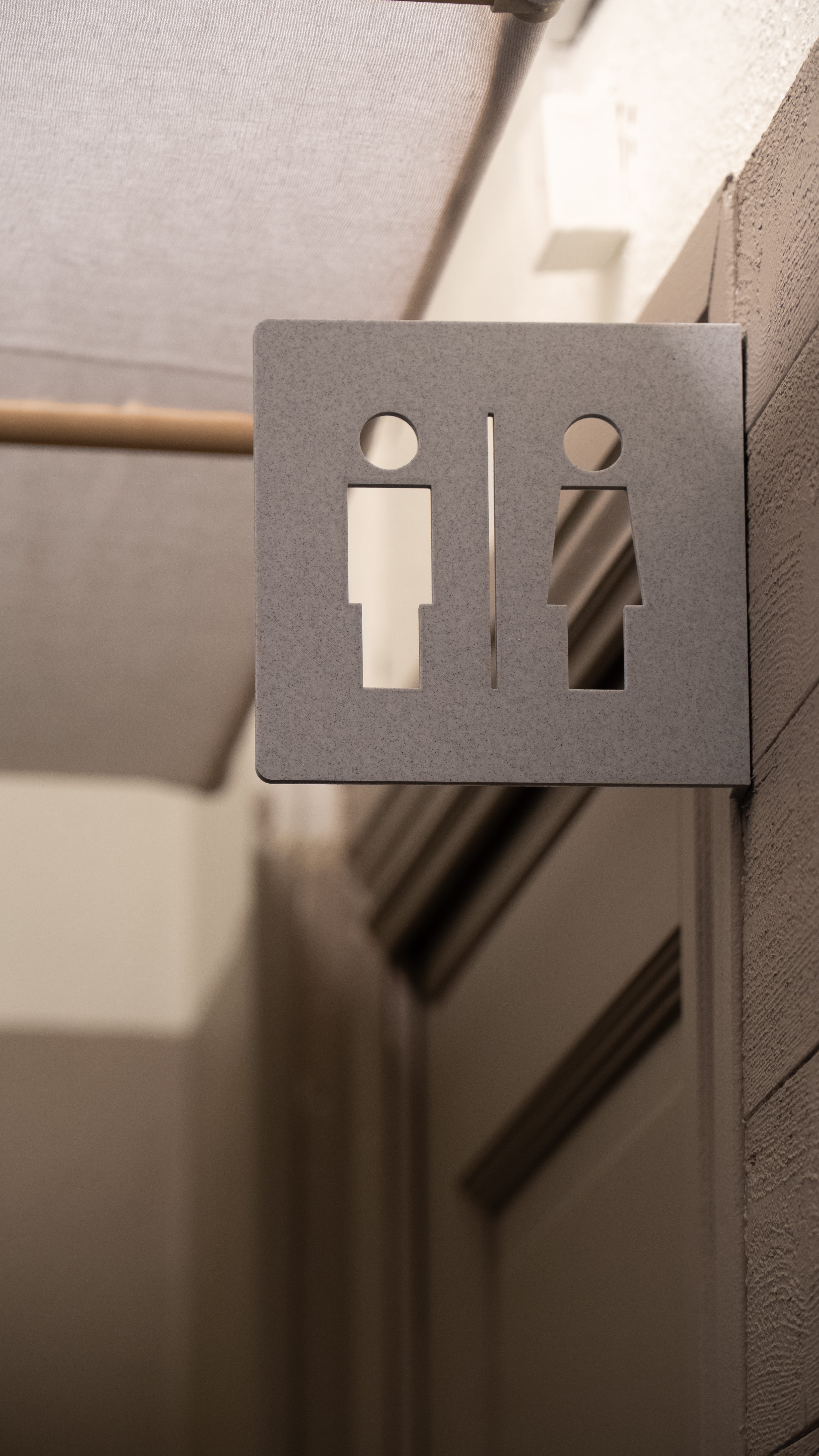
✔ Signage & Navigation – Guests struggled to find the bathroom and the correct light switch.
✔ Flooring – Slippery and perpetually dirty-looking, it had to be addressed.
What I wanted to achieve was a corridor that felt like an integrated part of the dining experience rather than an afterthought.
Painting on a Budget
Paint isn’t cheap.
I explored higher-quality options but, as expected, quality comes at a price. Given my somewhat tight budget, I decided to test a lower-budget option from a home goods chain.
I wanted the corridor to be darker, more somber and spa-like, so I made two selections of fine paints from the cheap-o home goods store:
Dark navy – Almost black in low lighting, offering a mysterious, shifting quality.
Taupe – A warmer, dark neutral that still kept the space feeling intimate.
After testing both:
The dark navy looked too blue and flat. I ended up using that for the bathroom instead.
The taupe, while not perfect, was workable.
In the past, I would’ve continued searching for the perfect shade, but I wanted to keep momentum and work with what I had. This is just one iteration—a diary entry in a continuing story. As the saying goes, perfection is the enemy of good.
I painted the walls and doors up to two meters high, leaving the top segment white to reflect more light.
Revamping the Bathroom
The guest bathroom had its own problems:
Difficult to find (poor signage).
Stained, poorly painted white walls.
Harsh overhead fluorescent lighting.
Since it was a small, self-contained space, I went all in with the dark navy paint, creating an effect of entering a void separate from the restaurant.
Before the soft launch, I had already installed new oak floorboards (found on clearance from a local business closing down) over the existing plastic flooring, which was in rough shape.
I then hung up a circular mirror with a blue rim (also found in IKEA’s second-hand section), which worked well with the now navy-blue walls.
To fix the lighting, I switched to a smart lighting setup from IKEA, allowing me to control dimming and temperature settings, making the space feel softer and more tranquil and less like a haunted hospital bathroom.
The bathroom is itty-bitty, so its difficult to capture in a photo, so just trust me that it’s much better. Here’s an image of the 3D-printed sign outside though:
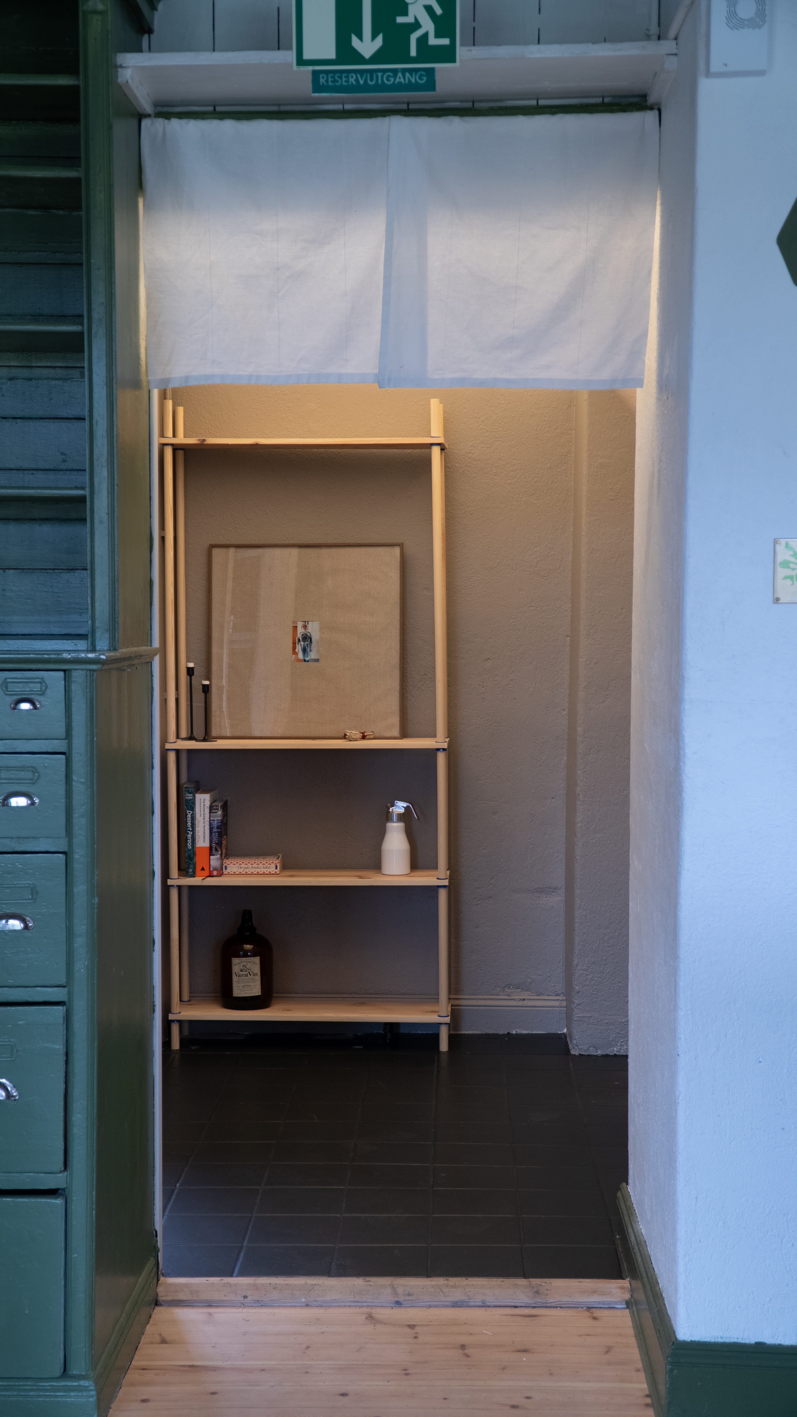
Using Tablecloths for Light Diffusion & Sound Dampening
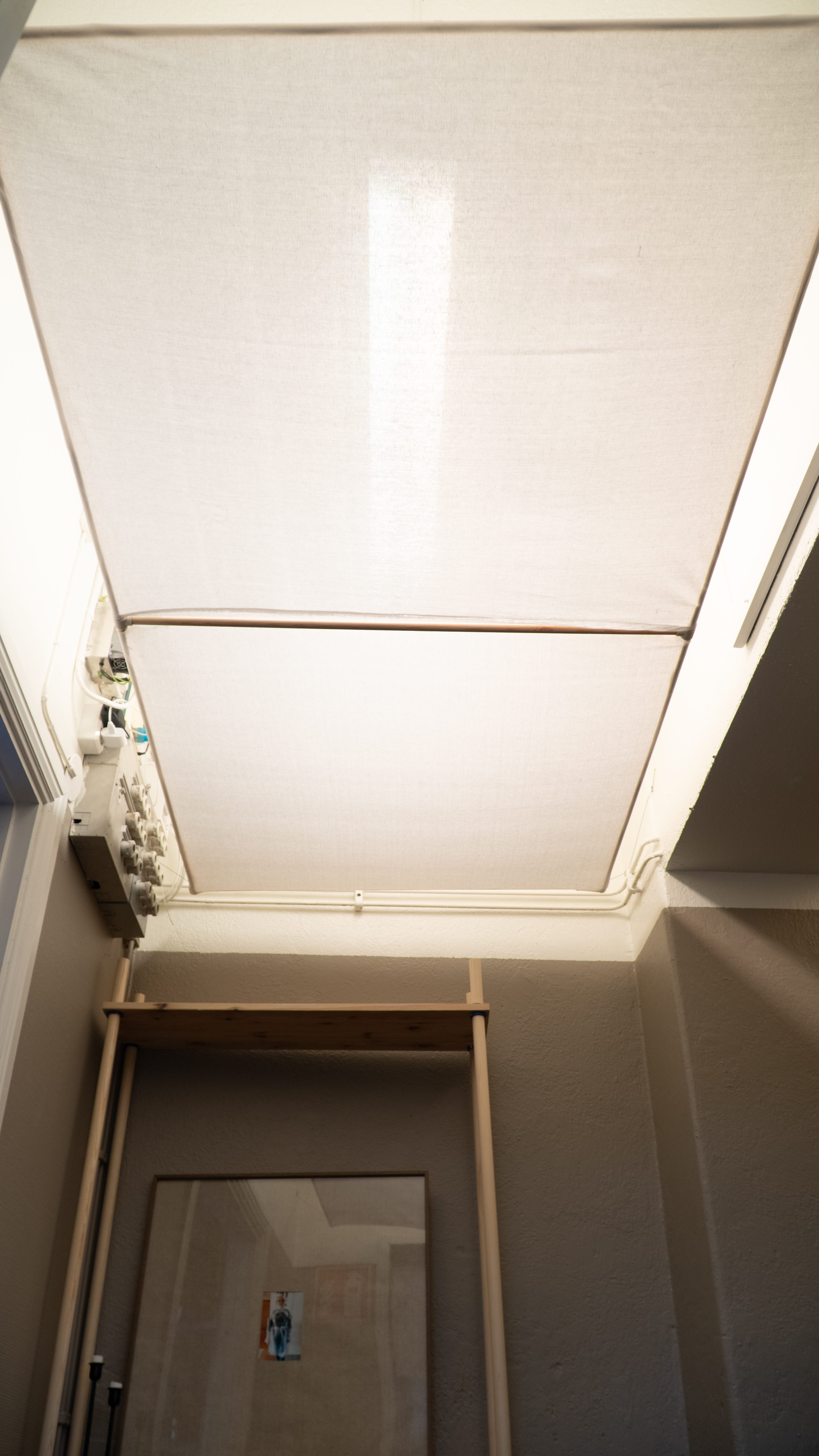
With no windows, the corridor gets very little natural light, which I chose to embrace as an opportunity to control the lighting entirely.
Since I was already planning to make new tabletops from spent grain from the brewery (more on this in an upcoming post), the linen tablecloths that were used previously would no longer be needed. They let light through nicely, so I figured I could repurpose them for light diffusion and to conceal the upper part of the walls.
This had three benefits:
Softening the light (for a more ambient atmosphere).
Concealing storage clutter (without eliminating practicality).
Helping with sound absorption, giving a more airy feel.
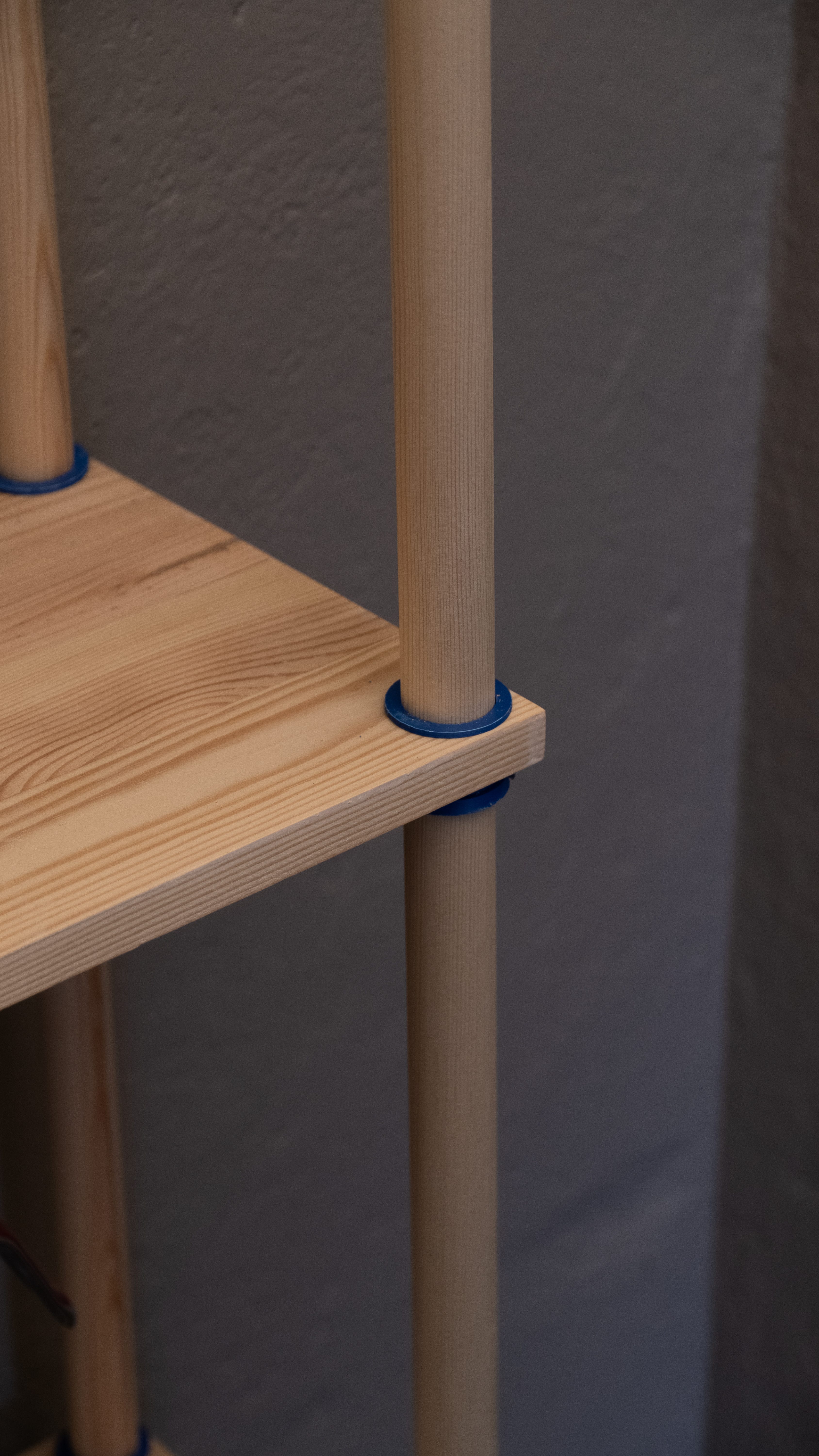
The tablecloths were draped over rods made from regular-ass pine, held together in a lattice structure using 3D-printed pipe connectors. The lattice itself is suspended by a thin steel wire, giving it a floating effect. The existing fluorescent lighting is diffused through the fabric, creating a softer, more inviting glow.
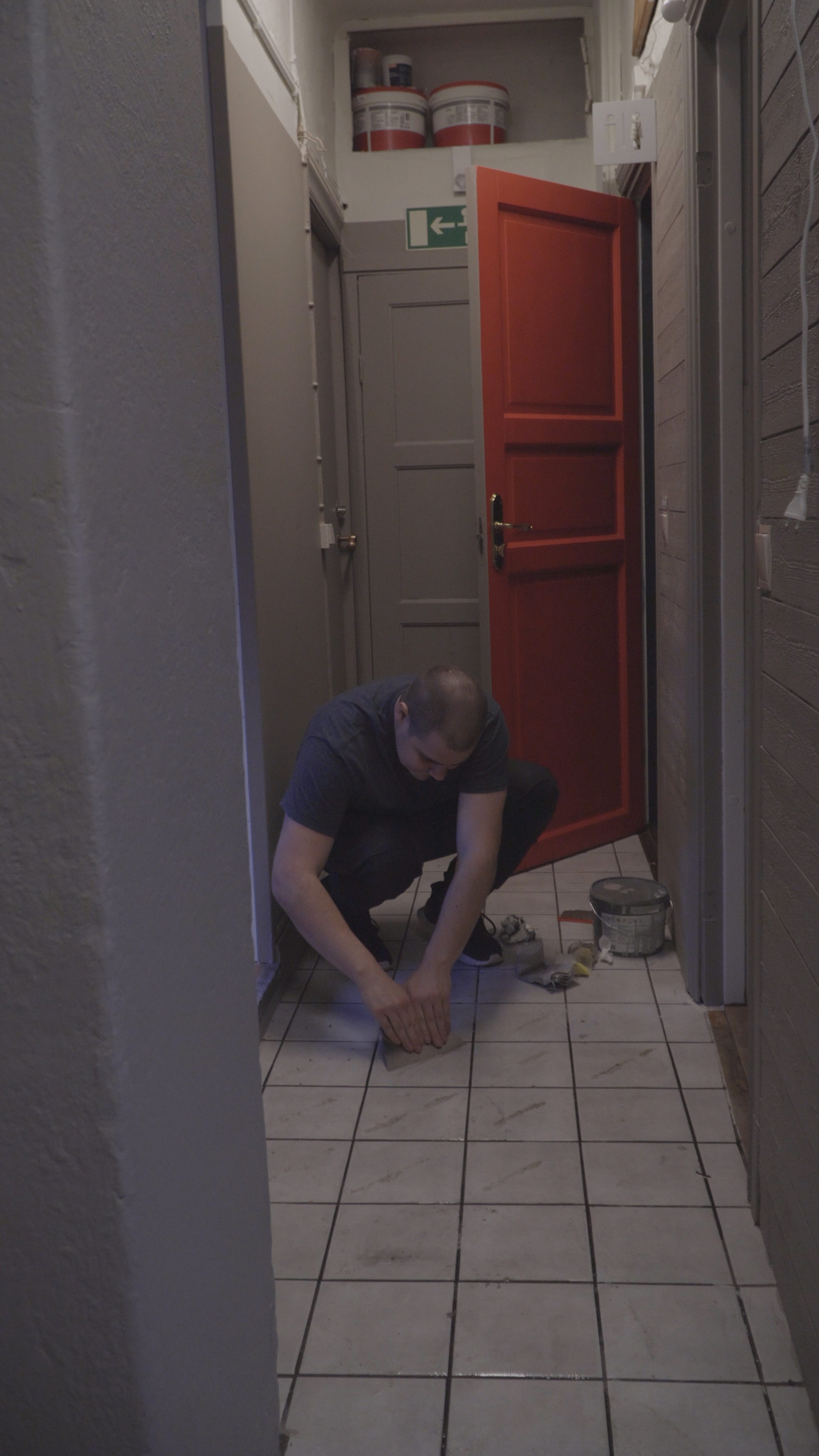
Fixing the Floor
With the walls, lighting, and overhead structure complete, I moved on to the flooring. I had initially considered making a sort of wooden grid similar to a boardwalk that would be placed on the floor to make it less slippery and give some texture. However, the bottom edge of the bathroom door barely has any clearance and I don't want to open that can of worms, so I opted to paint the floors in matte 2 component tile paint that would reinvigorate it and hopefully allow for a bit more grip at least. First, I had to remove the grip tape that the previous owners had fixed to the floor tiles, which turned out to be a longer process than expected. After trying a heat gun, paint stripping gel and good ol’ scraping, several applications of nail polish remover did the trick. After some cleaning and degreasing, I just rolled in on like any other paint, after which I applied a matte PU coating for extra resistance and mitigate slipperiness.
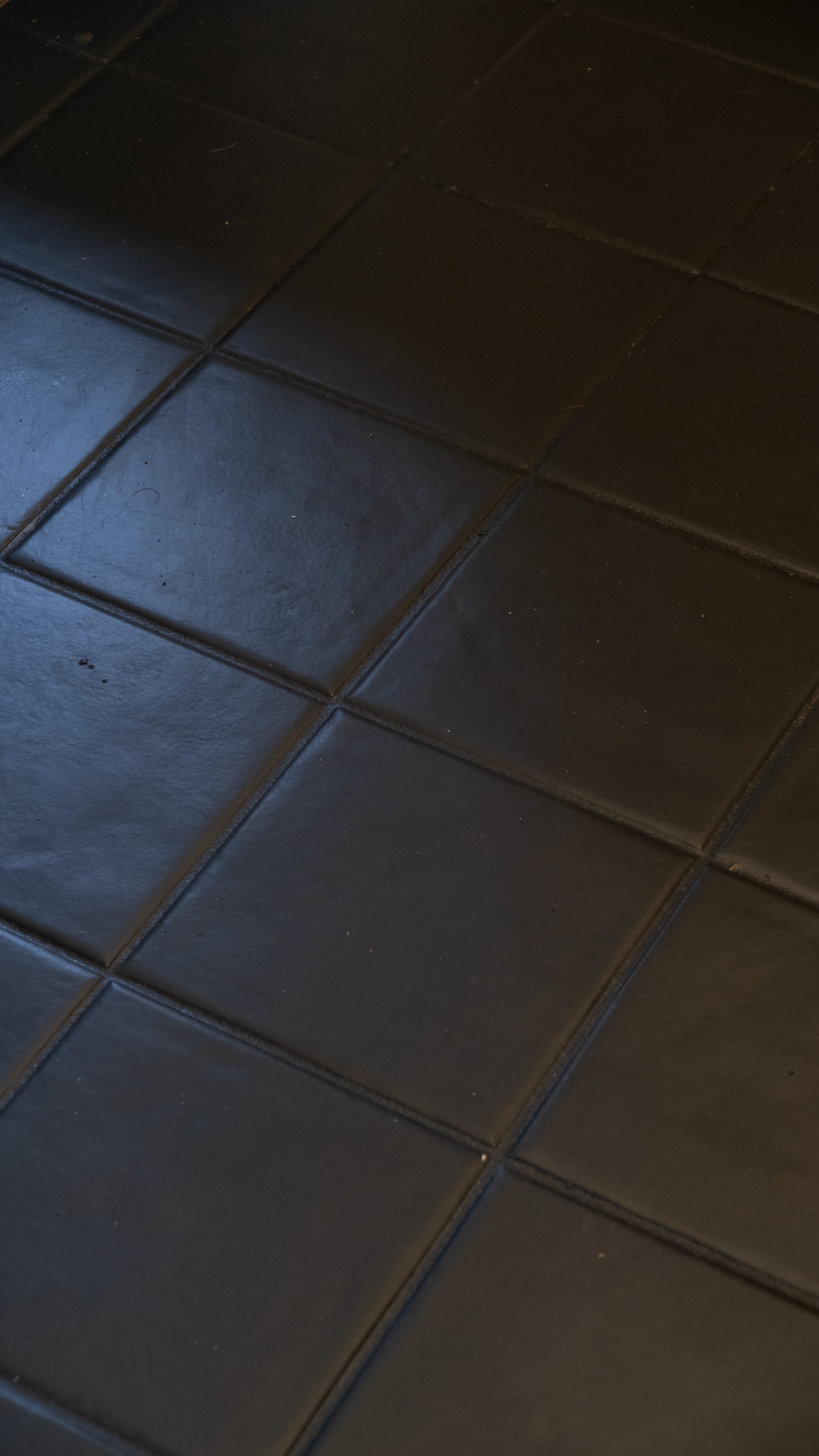
As for the color itself, I landed on an anthracite grey – perhaps a safer (aka boring) choice. I had considered something more colorful – such as a blue or brown – but since it tends to get dirty and wet quite quickly that a dark shade would hold up better. It also helps ground the space and give a moodier and somber feeling. While definitely an improvement, my assumption that the use of a dark color on the floors would conceal dirt proved to be misguided. The courtyard outside the restaurant is covered in gravel so shoes collect a lot of light colored dust that is very visible on the dark surface. We’ll see how this fares during service but it may have to be addressed for the next iteration of the restaurant
.
Finishing the Space
An Impromptu Shelf
When I took over the restaurant from the previous owners, I inherited a large appliance who’s purpose was unknown to me. After looking it up it turned out to be a crash freezer – a freezer that quickly lowers the temperature of food which prevents microbes from getting too comfortable and also saves time (instead of waiting for things to come down to room temperature to be placed in the fridge or freezer). It was placed right at the junction of the corridor by the kitchen, taking up a lot of space, so it needed to be moved.
Moving the motherfucker proved difficult for one person, so I fashioned a makeshift moving cart out of a small pallet I had lying around and some casters. The corridor was too narrow for it to fit through to the back, so I got it onto the cart and rolled it out the front door, where the pallet broke under the weight. Switching to a trolley and getting some help from my wife, we rolled it around the courtyard, and into the back entrance, where it nestled into its new home. Turns out it had conveniently obscured the view of some pipes sticking out of the floor as well as a few broken tiles. Instead of doing the proper thing and fixing the problem, I did what any founder/CEO would do – thought of other ways to cover it up.
Storage is always in high demand in a small restaurant, so I figured a shelf could be practical—even if it only held a relatively small number of items. Using some pine boards that were once ribs under a bed in our guest bedroom along with pine rods, I made a simple shelving unit with some custom 3D printed wedges for support and finished it with hardwax oil. I can’t take full credit for this design - the Danish brand Moebe uses a similar construction, only using actual carpentry to pull it off.
Noren Curtain
Being interested in Eastern schools of meditation, frequenting various spas that tend to take cues from Zen monasteries, as well as having spent almost a decade of my upbringing in Asia – it’s inevitable that influences from the continent find their way into my work. The draped lighting setup led me to want to separate the space even further with a noren curtain. Traditionally used in homes and businesses in Japan to keep dust and the elements out (while often doubling as signage), noren curtains are hung in doorways to indicate when a business is open, with their removal signaling that it’s closed.
I had some fabric left over and thought a short curtain would function as a sort of portal to separate the spaces while also helping to control the lighting. It’s hung up high so only tall people have to deal with the curtains touching their head or face (that’ll show them to dare to come to my restaurant and be taller than me). The curtain is held up by a thick-diameter pine rod, which in turn is mounted using 3D-printed brackets on each side of the corridor.
At some point I think I’ll make some some block printing stamps using the 3D printer and use it to print on the curtain, but I’ll save that for later.
Reflection
In many ways, the state of the corridor will not be the defining factor in whether or not the restaurant is successful. Perhaps if I left the corridor as it was, it wouldn’t be much of a drawback as a whole However, the whole idea with the restaurant and the general approach that i want to take more going forward, is in actually giving a fuck about things. I’ve found that in business its easy to optimise merely for profit and doing the bare minimum to meet a baseline of expectations toward the customer in service of increasing sales. This many times results in a soulless and cynical state of affairs that is not very fun for anybody. As stated elsewhere, I actually do want to make money, but I first and foremost want to create something that is enjoyable and special. In the end, if people like something while not feeling entirely pandered to, they are more likely to want to part with their hard earned money, creating a positive cycle of then being able to reinvest into things that make it even more special and fun. While this renovation is far from breaking any new ground, I think it does contribute to a more pleasant and coherent experience. When visiting a restaurant, you are foremost buying an experience and a big part of that is the setting.
Now that the transitional corridor space has been improved, its time to move on to the more central aspects – the outdoor area that will most likely be the most utilised during the precious few sunny months (or weeks if we’re unlucky), reworking the indoor dining space to be better, and of course, working more closely with forming the vision of the food that will be served along with their presentation in the form of plating, menus, photography and all the rest. I hope you stick around for that.
/Sam